Featured image of post Ideogram with cluster marks using ggplot2

Ideogram with cluster marks using ggplot2

I am trying to plot enriched functional clusters on each chromosome, like ideograms.

This is some notes on using the facet_grid function in ggplot2.

My data looks like this:
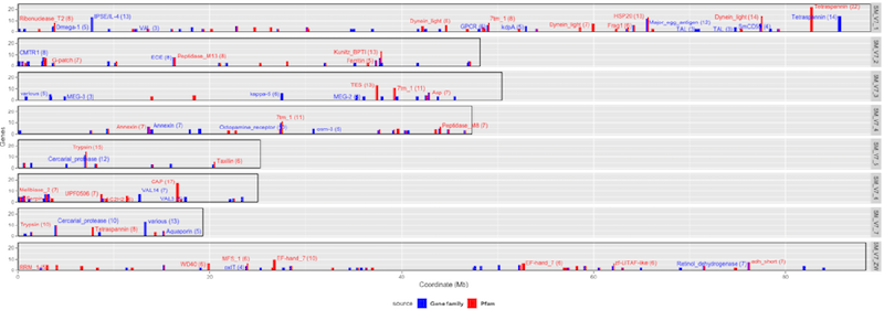
chr window function id name genes p-val start end chrlen source label
chr1 206 164a8da3b80 Dynein 7 0 77424754 81043029 88881357 gfam
chr1 206 PF01221 Dynein_light 14 0 77424754 81056868 88881357 pfam yes
chr2 5 PF05019 Coq4 3 0 2611802 3155461 48130368 pfam
chr2 5 f40b1ae1da7e4 CMTR1 8 0 2687527 4607079 48130368 gfam yes

Basically it’s a collection of enriched functional clusters (gene family and pfam) on each chromosome. I would like to plot those gene numbers as bar (at least 4 genes) and label those marked “yes” with the function names. From ggplot2 facet_grid() function seems suitable in categorising the data into each chromosome. And I used geom_bar and geom_label to plot and label clusters. For the chromosome I used geom_rect to draw a rectangle (not ideal though).

Here is the script with notes to myself:

 1
 2
 3
 4
 5
 6
 7
 8
 9
10
11
12
13
14
15
16
17
18
19
20
21
library(ggplot2)
library(ggrepel)
# read the data
clstall<-read.delim("combined_clusters.txt", sep=" ", header = F, col.names=c("chr", "block", "func", "name", "genes", "fdr", "start", "end", "chrlen", "source", "label"))
# subset the data
clst<-clstall[which(clstall$genes>=4),]

pp <- ggplot(data=clst, aes(x=start/1000000, y=genes, fill=source)) # bar fill color based on source
	+ geom_bar(stat="identity", position="dodge", width=0.3)  # overlapped bars will not stack
	+ geom_text_repel(data=clst[which(clst$label=="yes"),], mapping=aes(color=source, label=paste0(name, " (", genes, ")")), size=3.3, direction="both", max.iter=6000) # label from "yes"-marked, label color based on source
	+ geom_rect(mapping=aes(xmin=0, xmax=chrlen/1000000, ymin=0, ymax=25), fill="white", color="black", alpha=0, size=0.3) # the outer framebox as chromosome; size is the thickness
	+ facet_grid(rows=vars(chr)) # facet data based on chromosomes


pp <- pp + scale_x_continuous(expand = c(0, 0)) + scale_y_continuous(expand = c(0, 0)) # x, y axis starting from 0
	+ labs(x="Coordinate (Mb)", y="Genes") 
	+ ylim(0, 25) + scale_y_continuous(breaks=c(0, 10, 20)) # y limit and ticks/labels 
	+ scale_fill_manual(labels=c("Gene family", "Pfam"),values=c("blue", "red")) # re-define bar fill color 
	+ scale_color_manual(labels=c("Gene family", "Pfam"),values=c("blue", "red")) # re-define bar label color
	+ theme(legend.position="bottom") + theme(legend.text = element_text(size=9.5, face="bold"))  # legend position and text style
	+ theme_classic() # classic without grid lines

There is still one problem with the plot: some labels are overlapped with bars. Not sure which function to avoid this?

comments powered by Disqus
CC-BY-NC 4.0
Built with Hugo Theme Stack