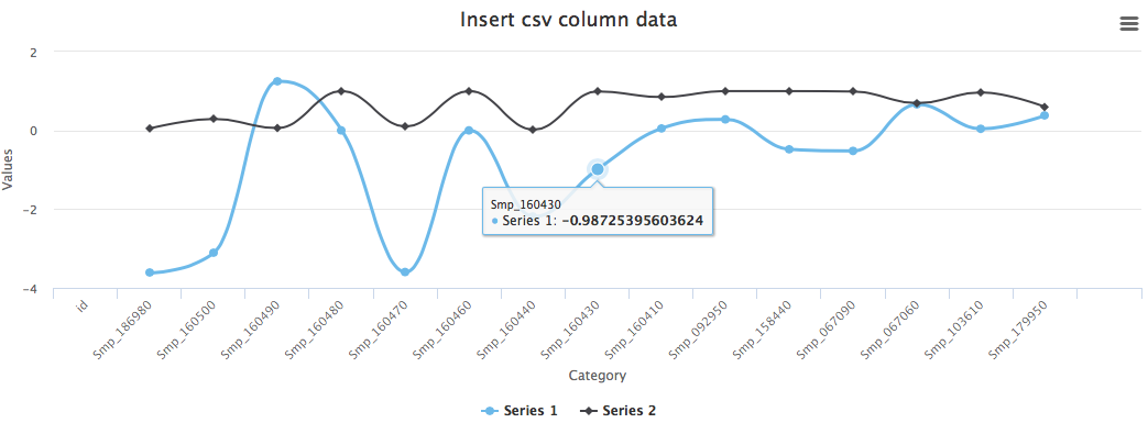
Say we have a 3-column csv file like this:
1
2
3
4
5
|
Smp_186980,-3.62031575129638,1
Smp_160500,-3.10831015633431,0.997289972899729
Smp_160490,0,1
Smp_160480,0,0.999489795918367
...
|
The first column is the category and the second col as x, the third as y.
We have built the chart:
 1
 2
 3
 4
 5
 6
 7
 8
 9
10
11
12
13
14
15
16
17
18
19
20
21
22
23
24
|
<div id="container" style="width: 80%; margin: 0 auto"></div>
<script>
    var options = {
    chart: {
        renderTo: 'container',
        defaultSeriesType: 'spline'
    },
    title: {
        text: 'Insert csv column data'
    },
    xAxis: {
        title: {
            text: 'Category'
        },
        categories: []
    },
    series: [{
        name: 'Series 1',
        data: []
    }, {
        name: 'Series 2',
        data: []
    }]
};
|
To read the csv, insert columns, and render the chart:
 1
 2
 3
 4
 5
 6
 7
 8
 9
10
11
12
13
14
15
16
17
18
|
$.get('data.csv', function(data) {
    // Split the lines
    var lines = data.split('\n');

    // Push column data into data list
    for (var i =0; i < lines.length; i++) {
        var cat = lines[i].split(",")[0]
        var firCol = lines[i].split(",")[1];
        var secCol = lines[i].split(",")[2];
        options.xAxis.categories.push(cat)
        options.series[0].data.push(parseFloat(firCol))
        options.series[1].data.push(parseFloat(secCol))
    }

    // Create the chart
    var chart = new Highcharts.Chart(options);
});
</script>
|
Here is the ouput:
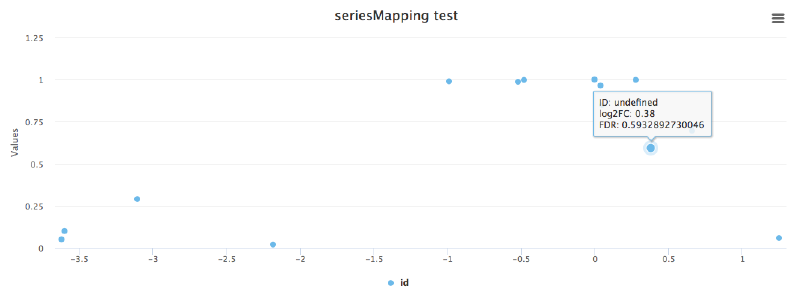
But if we want to have a scatter plot with x, y from column 1 and column 2, we could use the seriesMapping function:
 1
 2
 3
 4
 5
 6
 7
 8
 9
10
11
12
13
14
15
16
17
18
19
20
21
22
23
24
25
26
27
|
<div id="container" style="width: 80%; margin: 0 auto"></div>
<script>
$(function () {
  $.get('/Users/zl3/Documents/py-testfiles/rots-om-oi.csv', function(data){
    Highcharts.chart('container', {
       chart: {
         type: 'scatter',
         zoomType: 'xy'
       },
       data: {
         csv: data,
         seriesMapping: [{x: 1, y: 2, name: 0}]
       },
       title: {
         text: 'seriesMapping test'
       },
       tooltip: {
         formatter: function () {
            return 'ID: ' + this.name + '<br/>' +
            'log2FC: ' + this.x + '<br>' +
            'FDR: ' + this.y;
         }
       }
    });
  });
});
</script>
|
Result is shown above. A bit strange that I not undefined names.
UPDATE 21/07/2017: in the tooltip you need to use this.point.name instead of this.name, also it seems that both x and y should be numbers.
Here is one example.